I am co-founder of a games studio which makes accessible games. I created its graphics effectively as a client to my business partner, who also devised the company's name.
We settled upon the idea of referencing a kaleidoscope, as it is the embodiment of a diverse and colourful toy. Most of the company's graphics branch off from this core concept.
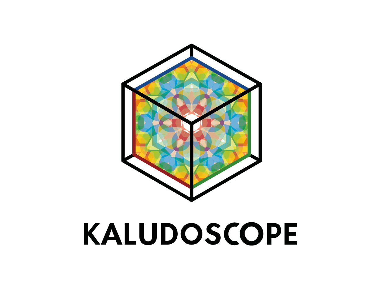
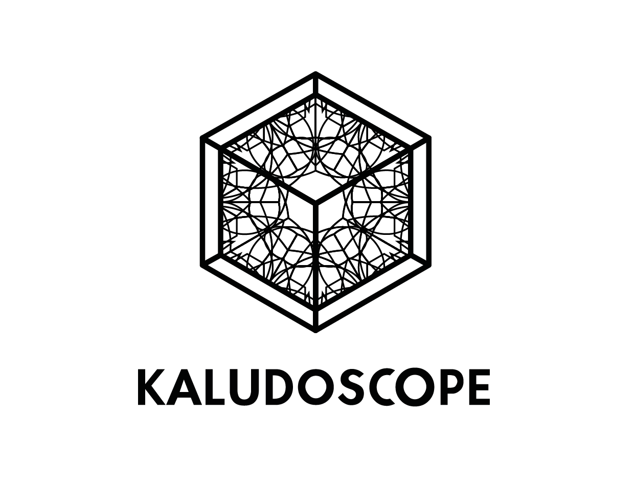

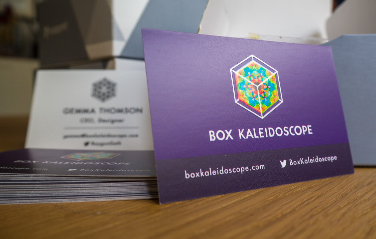
The design rules were settled before the company was formally registered in Sweden, so our earliest printed materials feature the name 'Box Kaleidoscope'. It is this pun (on 'box collider') which informed the wireframe shape of the company's logo - highlighted on all our cards with a spot gloss.
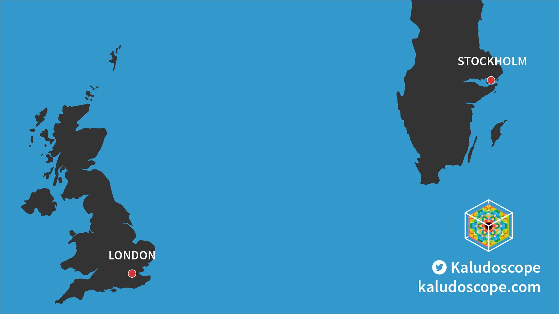
This backdrop graphic features in many of our pitch decks, highlighting the fact that the company spans two countries.